
Olive Taylor
Professor Terryl Atkins
VISA 1500-01
October 3, 2022
Assignment 1: Greenwashing in Advertising – Nestle
“Greenwashing” is a term first coined in 1983 by Jay Westerveld, an environmentalist, and is defined as “the corporate practice of making diverting sustainability claims to cover a questionable environmental record” (Watson, “The Troubling Evolution of Corporate Greenwashing”, p. 38). Nestle, who reported a net income of $17.2 billion in 2021, is a company that participates in this deceptive form of advertising; specifically, with their “Eco-Shape Water Bottle”. Watson writes, “the bottled water giant has claimed that its Eco-Shape bottle is more efficient, that its Resource recycled plastic bottle is more environmentally responsible and that its use of plant-based plastics is less damaging to the planet.” (p. 39). Here, we’ll be looking at Nestle’s advertisements for this Eco-Shape Water Bottle, which were seen on billboards and bus stops worldwide.
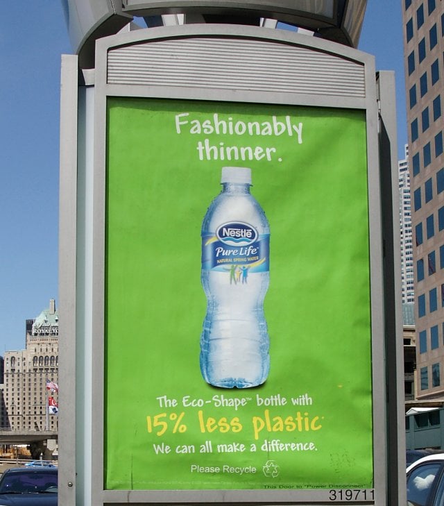
This is a still-based ad, showing a plastic bottle of water imposed on a green background, with the words “Fashionably Thinner” above the bottle. Below the bottle, the words read: “The Eco-Shape bottle with 15% less plastic. We can all make a difference. Please recycle”. Companies will classically use the colour green, as well as language such as “eco”, “bio”, and certain percentages to attempt to convince consumers that their product is environmentally beneficial. Green is the colour most associated with life, plants, and our planet Earth. The main subject of the ad is the bottle of water, which is placed largely and directly in the center of the photo. The lighting is strong and the quality is good; viewers can even see droplets of condensation on the bottle. This, as well as the blue and green colours, make the photo look refreshing. If the viewer didn’t notice they were thirsty before, this ad would surely make them realize it. The use of the words ”fashionably thinner” is a particularly interesting one; this might be a stretch but I was wondering if this wording was meant to contribute to the world’s beauty standards of being thin = being fashionable, as well as to mean that the bottles themselves are thinner because of the 15% less plastic that’s being used. I think the ad is trying to convince consumers that buying this particular bottled water is fashionable, trendy, and better for the environment than opposing bottled water brands, despite the common knowledge that bottled water is an unnecessary use of plastic. In Bruce Watson’s article, he also mentions the irony that Nestle operates in manufacturing bottled water in California, Oregon, and Arizona, all states that are experiencing droughts and water shortages (p. 39).
I don’t find this particular advertisement effective; I think most consumers who are genuinely trying to reduce their carbon-footprint on the Earth typically stay away from buying bottled water, and those who continue to buy bottled water are likely to buy more affordable brands, such as no-name brand water.
Felix
I think you did a good job summarizing Nestlé’s part in the deceptive practice of corporate greenwashing. Why? As you likely knew beforehand, Nestlé as an organization is known to be quite the climate criminal. From a shocking carbon footprint to unsustainable water sourcing practices, Nestlé is no saint. You pulled in clear information from your scholarly source towards the end of the analysis that confirmed this sentiment.
You also make a very valid point – bottled water is rather unnecessary. I also agree with your findings that the ad is quite deceptive. I also found the wording of “fashionably thin” intriguing. I can’t imagine buying a bottle of water only because it is “thin”; part of me wonders if, as you said, Nestlé made the connection of thin=desirable and just rolled with it?
In terms of the colour use on the ad, and the points you made regarding how organizations use the colour green to represent sustainability, the environment, etc.… I found your analysis spot-on. I also happened to have a “eco-minded” advertisement for my analysis, and despite my ad being for an entirely different company, the same “green” theme was present, with plants, lots of colour, and some of the classic corporate eco-friendly terms.
If you wanted to get into even more detail regarding Nestlé’s environmental footprint, I think you could have benefitted from consulting a second scholarly source. With Nestlé being as massive as they are, I know there are lots out there that provide some super interesting, but troublesome statistics. Adding these to your analysis could solidify your stance even further, I would have liked to see some information on the impact that Nestlé has had on our planet.