
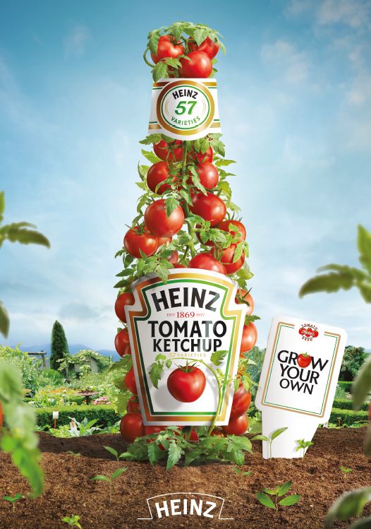
The advertisement that I chose is from “Heinz Tomato Ketchup”. The Heinz brand owns several products but this advertisement is specified in the tomato Ketchup. The advertisement is in a tomato farming field where fresh tomatoes are stacked in a way that they form the brand’s bottle with its label on the top and back of the bottle and with a label next to it with the words “grow your own”. The message the advertisement is trying to give is that the brand is responsible for its customers’ health by showing that they grow and harvest their tomatoes for the product, this creates the assumption that the brand promotes ecology and wants to be responsible for producing their products without harming the environment and their consumers’ health.
The advertisement tries to persuade consumers to buy Heinz ketchup by emphasizing its natural ingredients in their recipe. One main point is the label at the top of the advertisement says that the brand is 57 years old, so it can be assumed that it is a special advertisement for the anniversary of the brand and brings the reminder to their loyal and new consumers about the ingredients of the product. Additionally, in the label “grow your own,” it is understood that the brand is responsible for the whole process, giving an idea of loyalty and that the brand protects and are conscious of their costumers. The target audience for this advertisement is the general public, loyal and new customers and to make them use the product for several things or buy the sauce.
The way formal elements are used is as follows: the first element it is the psychological effects of colors and shapes in this case the image is a green field with some plants and trees with the sky blue and in the middle, the tomatoes that forms the shape of the bottle. In the case of colors, the image is very harmonious as the green color of the field, the sky blue in the upper part of the background and the red color of the tomatoes are complementary so it looks harmonious. Secondly, the placement and size of elements there is some trees and plants of the field that are small or medium in the foreground and the tomato bottle is bigger occupying all the planes that leds to being the focal point since the bottle is the largest object and with vibrant color is the one that attracts the most attention of the costumer. Likewise, the labels are white, which also draws attention to that details and the few words that the advertisement contains so that consumers can acquire more information about the product and the brand. Finally, for the position of the bottle, it could be said that the point of view is at the same level as the bottle being in the middle of the image as it is possible to see completely the whole bottle and its background with a little of what is before the bottle giving a complete harmony in the advertisement.
In my personal opinion, the advertisement is original by using non-typical elements to be in the field and using the green and blue colors that are very similar and are side by side on the color wheel instead of the red color that is on the other side of the wheel making contrast and red comes to highlight more than the other colors. As well as the perspective in the foreground you can see plants very close to the camera and then there are some small trees and the big bottle of the brand. Also, this advertisement caught my attention because they use their main ingredient to show their product which its somethin new and give the message of how the whole product is organic.Additionally, the brand is known for trying to be sustainable, as they have been using reusable plastics for packaging for some time now, they also promote sustainable agricultural practices for growing tomatoes and try to reduce their carbon footprint and food waste. However is also known that at least for the tomato sauce all its ingredients are organic and none of them are artificial, neither with colorants nor chemical preservatives, therefore it is responsible for the health of its consumers.So this is an ad that promotes sustainability and becomes an ad with interesting elements to observe.
References
“Elements and Principles of Ad Design | Academy.” 2022. Rocketium. https://rocketium.com/academy/elements-and-principles-of-ad-design/.
Government of Canada. 2015. “Elements of Visual Interpretation.” https://natural-resources.canada.ca/maps-tools-and-publications/satellite-imagery-elevation-data-and-air-photos/tutorial-fundamentals-remote-sensing/image-interpretation-analysis/elements-visual-interpretation/9291.
Bodin, John. 2016. “Art by Design: 11 Elements of successfull images.” https://www.breathingcolor.com/blogs/news/elements-of-design?srsltid=AfmBOort5QtlsmD0O7rWyYRkG_tRdZsDOuGwyI9HoKXhvEls_Vk6a80Y.
bipin shrestha
Your analysis of the Heinz ketchup advertisement’s colors, forms, and deft marketing strategies was excellent. Heinz’s efforts to promote the notion that their food is fresh, nutritious, and environmentally friendly are evident to them. They are obviously aware of what Heinz is trying to promote the notion that their food is wholesome, fresh, and environmentally friendly.And yeah, they explain how the ad draws people in with its bottle shaped pile of tomatoes and the whole “grow your own” message. That part’s great. But when it comes to greenwashing? They kinda skim the surface.
Sure, they mention that Heinz uses organic ingredients and recyclable plastic, but do they ask the big question? Is Heinz really as eco-friendly as they claim, or is this just another case of a big brand slapping a “sustainable” label on itself for good PR? They don’t really dig into whether Heinz has ever been called out for exaggerating its green efforts or if their sustainability claims actually hold water. Without that, it’s kinda like reviewing a movie by only talking about the poster.
Another thing they focus a lot on how the ad looks but miss the bigger picture. Like, does this ad make people feel like Heinz is greener than it actually is? Does it distract from any less eco-friendly things the company does? These are the juicy bits they left out.