
The following advertisement was made by the personal care brand Dove, owned by the British consumer goods company Unilever. The brand was founded in the 1950s by the Lever brothers and launched in the United States in 1957. The time-based advertisement promotes Dove’s body scrub line. It features different women of various skin tones applying the product, along with visual motifs such as rose petals and pieces of dragon fruit and coconut.
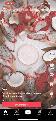
Initially, the advertisement starts with a top-angle camera shot showing pieces of dragon fruit and coconut, encircling a container filled with body scrub on a white background. It fills the screen with pink, white, yellow, green, and brown colours, creating contrast with the white background. The camera then zooms in on the scrub in a circular motion as the brand’s logo, a white dove’s silhouette, appears above the body scrub, quickly shrinks, and disappears. There is then a cut to a white background, where a white woman applies the scrub to her body and rinses it off with water. Meanwhile, bold white letters appear on the screen, reading “exfoliate, hydrate, radiate” in a vertical arrangement. It then cuts to a shot of her sitting with her knees up, dressed in a pink top and blue shorts, while the phrase “with the scrub that treats your skin right”, along with another shot of her smiling and holding the transparent body scrub container with a pastel orange cap. The camera then quickly pans to a selfie shot of woman with a medium skin tone and curly hair smiling, with the white letters reading “it’s giving… freshest skin ever” in a vertical arrangement and in the center of the video, before another quick circular top angle shot zooming on multiple white and pink rose petals surrounding the body scrub container with a white background. There is then another shot of dragon fruit pieces and water droplets with a white background and white letters reading “it’s giving… paradise vibes” at the center of the video. The camera then quickly moves to another woman of medium skin, smiling before a close shot of the light pink body scrub itself getting lifted with the white letters reading “Level up your glow up”. Finally, there is a quick shot of a black woman smelling the body scrub with the white letters reading “Smell divine” in the center of the screen, before a final shot of different body scrubs varieties showcased at different heights creating a layered display, with a white background, the company name at the top left-hand corner, and nay blue letters on top of the display reading “Dove Body Scrubs #ItsGiving”.
The advertisement conveys a message of effective self-care while emphasizing variety and diversity. This is visually achieved by using close-up shots of products that present scrub as natural. Dragon fruit, rose petals, and visible water droplets signify freshness and tropicality. The repetitive use of short on-screen text makes a set of claims about the product’s benefits and experience. The placement of the text in the center and its bold white typography forces the viewer to read the product’s promised effects while they watch the imagery behind. Models with different skin tones are shown using the product to imply diversity. The final staggered display of variants at different heights reveals choice and variety of products, while the pastel, bright palette brings forth softness and cleanliness, attributes associated with Dove as a brand.
The ad is effective for its probable target audience, young to middle-aged women interested in body care products, because it ties visual motifs (colorful fruits, soft pastels) to functional claims (exfoliate, radiate) and representation (models with different skin tones). It also uses short, stackable clips to create a short and light ad that fits the format of the social media it was posted on (TikTok). It achieves this by using quick cuts, clear text overlays, and close-ups. This matches the current way of making videos in the digital age and accounts for people’s generally short attention span. Personally, the ad appears visually pleasing and appealing, although it raises questions about the company’s authenticity. The use of tropical fruits points towards nature and naturality, but the visual elements do not guarantee sustainable sourcing or cruelty-free manufacturing.
One organization that criticizes Dove and its parent company’s (Unilever) environmental practices is Greenpeace, an independent global campaigning network. The organization has produced analyses tying large consumer brands (including Unilever) to deforestation and fire-linked emissions through palm oil and pulp supply chains. Greenpeace also warns about corporate “greenwash,” noting that sustainability marketing can leave brands vulnerable if supply-chain evidence contradicts their claims.
Another organization that criticizes Dove’s parent company is Amnesty International, a global movement that campaigns to end human rights abuses. Its reporting has documented serious human-rights and labour abuses in palm oil supply chains used by major consumer-goods companies. The report argues that “sustainable” labels can mask ongoing problems like child labour and hazardous working conditions unless companies enforce stronger oversight. This is relevant because many personal-care ingredients (including those used by large conglomerates) are linked to palm-oil supply chains. Unilever has published grievance trackers and sustainability plans and claims to investigate and remediate supply-chain issues. However, NGOs (Amnesty, Greenpeace) continue to call out ongoing problems (deforestation, labour abuses), showing that while corporate commitments exist, external actors still find gaps in implementation and enforcement.
Bibliography
1. Michael I. Hill and Albert J. Post. “Design of the Dove Beauty Bar.” In Chemical Product Design: Towards a Perspective through Case Studies, edited by Ka M. Ng, Rafiqul Gani, and Kim Dam-Johansen, 275–288. Amsterdam: Elsevier, 2007.
2. Geoffrey Jones. Renewing Unilever: Transformation and Tradition. Oxford: Oxford University Press, 2005.
3. Response to “Help with analysis of advertisement” ChatGPT-5, OpenAI, September 2025, edited for style and accuracy.
4. Response to “Help with evaluation of advertisement” ChatGPT-5, OpenAI, September 2025, edited for style and accuracy.
5. Greenpeace International. The True Cost of Palm Oil and Wood Pulp (report). Amsterdam: Greenpeace, 2019. https://www.greenpeace.org/static/planet4-international-stateless/2019/12/20191205-True-Cost-of-Palm-Oil-and-Pulp.pdf?utm_source=chatgpt.com
6. Response to “Give summary and conclusions of this article” ChatGPT-5, OpenAI, September 2025, edited for style and accuracy.
7. Amnesty International. The Great Palm Oil Scandal. London: Amnesty International, 2016. https://www.amnesty.org/fr/wp-content/uploads/2021/05/ASA2151842016ENGLISH.pdf?utm_source=chatgpt.com
8. Response to “Give summary and conclusions of this article” ChatGPT-5, OpenAI, September 2025, edited for style and accuracy.
9. Unilever. Unilever Palm Oil Grievance Tracker, Updated April 2024. (Report). Unilever PLC. Accessed September 30, 2025. https://verite.org/wp-content/uploads/pdfs/flddi/element-4-unilever-palm-oil-grievance-tracker-apr-2024.pdf.
10. Amnesty International. The Great Palm Oil Scandal: Labour Abuses Behind Big Brand Names. London: Amnesty International Ltd., 2016. https://www.amnesty.org/en/documents/asa21/5184/2016/en/.
Nevaeh Servia
I believe that this response encapsulates this advertisement in a lot of detail both connotative and denotative. I enjoyed the way they not only described what the ad actually looked like as well as all the underlying meanings and purposeful aspects that may get brushed over. A good example of this is the way they used different races of models to insinuate diversity within their company with no real proof of that outside of advertisement. The aspect of green washing was thoughtfully analysed as Keita touched on the infractions doves parent company, Unilever have had. This text touches on the many ways Unilever has gone against their claims of environmental sustainability because of their links to deforestation and fire linked emissions.
The point of this advertisement is to promote their new body scrub as well as their own brand inclusiveness. It also promotes how well their product works against sweat, dead skin, etc. Keita does a great job of encapsulating the advertisements main messages without missing any key points, at least none that were visible to me. She went out of her way to use many extremely credible sources such as Oxford University Press and Greenpeace. Keita also utilised AI as a tool to break down some of these complex texts into more digestible summaries that aid in a deeper understanding of her articles. I feel as though if they criteria of the assignment were slightly different I would touch on the “Gen Z Slang” the brand used in their advertisement to appeal to the younger generation but after all this assignment focuses on the power of photos. Other than that this analysis feels very strong and I thoroughly enjoyed Keita’s take on this Dove ad.
-Nevaeh Servia