
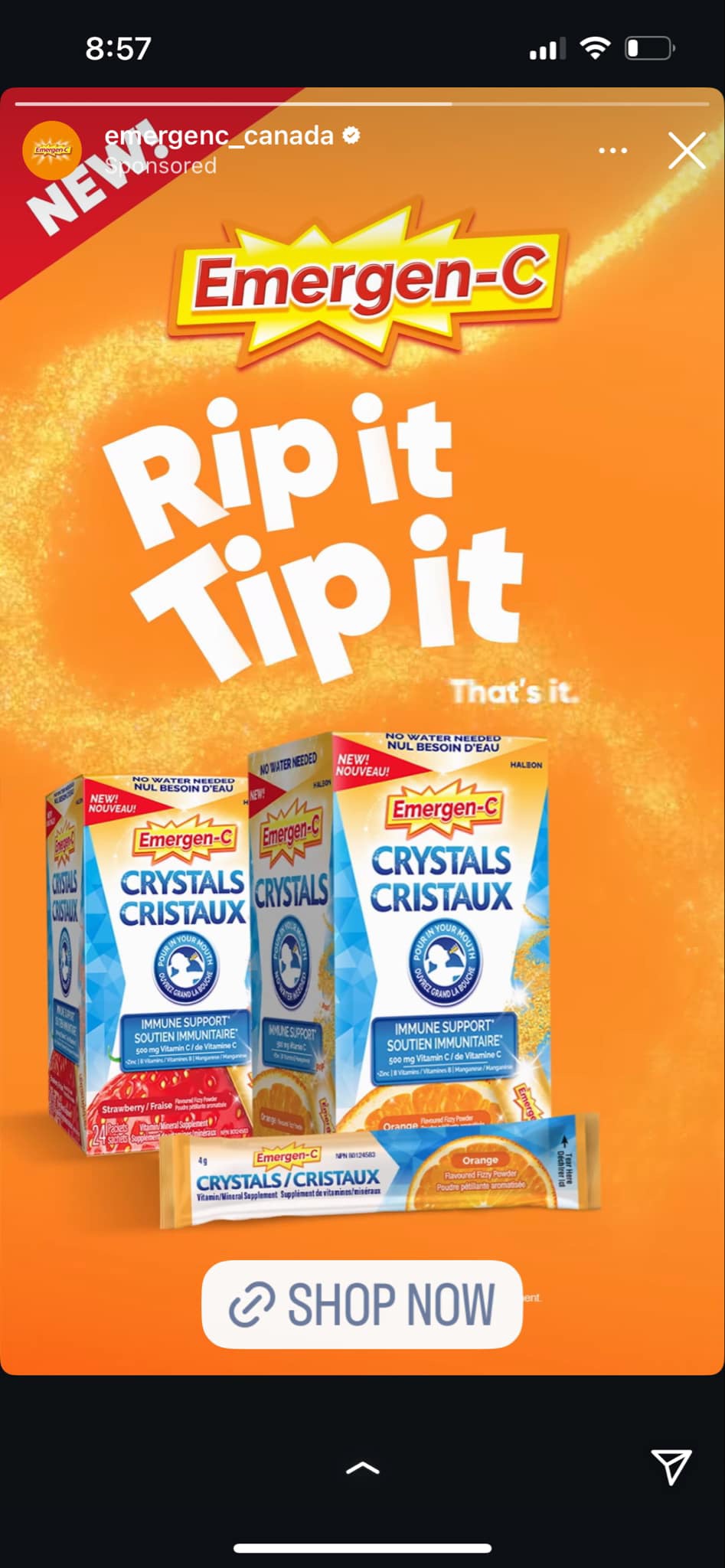
The advertisement was created by Emergen-C Canada to promote Emergen-C Crystals, a vitamin supplement that supports immune health and boosts energy. This still image ad uses bright colors, bold text, and clear product images to grab attention. It showcases three boxes of Emergen-C Crystals in different flavors, Strawberry and Orange, with a single-serving packet placed in front to highlight its portability. The catchy phrase “Rip it, Tip it” shows how easy the product is to use, while the label “No Water Needed” points out its convenience. The product packaging features text in both English and French.The background features a vibrant orange swirl, giving an energetic feel to the advertisement. A “Shop Now” button encourages viewers to make a purchase.The ad is organized into sections, with bold white text in the center that captures attention first. The product images are placed at the bottom, ensuring they are clearly visible. A bright red “NEW!” The label in the top left corner emphasizes that this is a new product, enhancing its appeal to potential buyers.The bright orange color symbolizes energy, health, and vitality, resonating with the product’s intended benefits. The white text stands out sharply against the orange background, making the message easy to read. Additionally, the blue on the product packaging adds a touch of freshness.The close-up shots of the product ensure that the branding and packaging details are clear and easy to see.The ad effectively communicates that Emergen-C Crystals are a fun, easy, and convenient way to boost immunity and energy. The “No Water Needed” message highlights that the product can be taken anywhere and anytime, making it perfect for on-the-go lifestyles.The unique feature of “No Water Needed” sets it apart from traditional vitamin powders, making it ideal for busy individuals who may not always have water available. This fits with modern lifestyles where people seek quick and easy ways to take care of their health.
As this is my first time seeing advertisements like this and I haven’t tried any vitamin supplements, I didn’t recognize the brand at first but I did some research and got to know that it’s a well known brand for supplements.The ad is effective in capturing attention and clearly outlining product benefits, but it lacks information about sustainability and social responsibility. However,Haleon, the parent company of Emergen-C, has made commitments to sustainability, including recyclable packaging and efforts to reduce its carbon footprint. The company has faced some legal challenges, including lawsuits related to misleading product claims. Critics have argued that their sustainability efforts are progressing slowly, although the company is taking steps to improve packaging and minimize waste. Additionally, they have adjusted their legal strategies in response to lawsuits, demonstrating that they are attentive to regulatory and consumer concerns.This Emergen-C advertisement is an excellent example of effective marketing. It uses bright colors, an engaging design, and a straightforward message to capture attention. The emphasis on convenience, energy, and immune support makes it appealing to a wide audience, especially those who care about their health.This ad aligns well with current health trends where consumers increasingly prioritize their well-being. Many individuals are looking for easy ways to boost their immune system, especially in the wake of recent global health concerns. This focus on convenience and health resonates particularly with millennials and Gen Z, who value products that fit into their fast-paced lifestyles.Moreover, the trend of seeking quick health solutions is prevalent among busy professionals and parents who face multiple responsibilities. This demographic often looks for products that are effective yet easy to incorporate into their daily routines. By presenting a product that requires no water and can be taken on the go, Emergen-C appeals directly to this audience.
Overall in my opinion, the Emergen-C advertisement effectively showcases its product using eye-catching visuals and straightforward messaging. The ad does a great job of showing the convenience of the Emergen-C Crystals and their benefits for energy support. However, there are areas for improvement,such as by including information about eco-friendly practices and providing more details about the ingredients and health benefits. The ad successfully identifies and targets health-conscious consumers who prioritize convenience in their daily routines. I think that providing more detailed information about the ingredients and their specific health benefits would strengthen the ad’s credibility.By being more informative, the ad could build trust and reliability, encouraging potential customers to choose Emergen-C over competing products.Although there are areas for improvement, the Emergen-C advertisement does an excellent job of creating excitement around the product.Overall, the ad has the potential to succeed in a competitive market by addressing these current consumer trends and aligning more closely with the values of today’s health-conscious audience. By adding elements of sustainability and transparency, the advertisement could have enhanced its effectiveness.
Resources
MacMillan, Amanda. “Does Emergen-C Really Work?” Health, October 23, 2024. https://www.health.com/condition/cold/does-emergenc-work.
Jacob, Divya, Pharm. D., and Pallavi Suyog Uttekar, MD. “Does Emergen-C Really Work?” MedicineNet.
https://www.medicinenet.com/does_emergen-c_really_work/article.htm.
Karma Marzouk
I think you did a great job describing the ad, especially explaining what all the colour’s may represent in this ad in terms of health and wellness. For example, orange being a colour that represents energy, health and vitality, or blue symbolizing freshness, which in other scenarios those colour’s could mean different things, but I like how you touched on their significance to this ad specifically.
Throughout your analysis, you mention the practicality of this product, For example, you mention the phrase ‘Rip it, Tip it” expressing the easy functioning of the product, and “No Water Needed” expressing product directions as well as the ‘on the go’ essence of the product.
You also mention things in the ad like “Show Now”, and “NEW!” that motivate viewers to become buyers, as well as the audience this ad is geared towards being Gen Z, and how the convenience of the product will attract younger buyers.
Something you may have missed in your analysis, is the “that’s it.” written below “Rip it, Tip it” on the right. Even though it is a small detail, I think it’s important to mention because it showcases the intention of the company’s attempt to really engrave in the viewer’s mind the ease of product.
I’m not entirely sure if your use of resources are scholarly, so next time would make sure they are is scholarly sources are required for this assignment.