
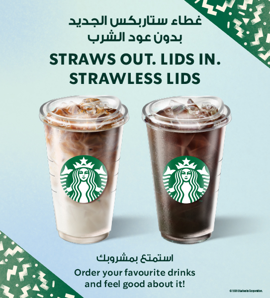
The advertisement I have chosen is from Starbucks Coffee promoting their straw less lids from their new cup design that was released in 2020. This is a still ad in a magazine, newspaper or for a social media post. The advertisement shows two iced beverages with new lids. In big bold font at the top of the ad it states “Straws out. Lids in. Strawless Lids” Below the picture of the cups is a slightly smaller font which states “Order your favourite drinks and feel good about it!”.
The imagery in the ad is very realistic. It is centered with the focus being on Starbuck’s drinks. Starbuck’s logo really stands out on the cups, and it is intentionally enlarged and made brighter in green and white colors than the rest of the imaging on the ad. The drinks are a bit muted in color, although there is an artificial looking sheen from the cups. The background is a simple pale blue, but on the upper right hand and bottom left-hand corners of the ad, there are these green triangles that have inside them a confetti-like pattern. This graphic design is in Starbucks green and white logo colours.
The message in the ad conveys that consumers are getting a new style of cups. It is a very simple phrase like “Out with the old, in with the new”. The smaller slogan at the bottom is more of a feel-good statement to the consumer. In an article I read, it stated that “As consumers become increasingly complicated, rushed and running out of time, the brand’s ability to simplify decision making and reduce risk is something valuable.” (Tsai, Exploring the effect of Starbucks’ green marketing on consumers’ purchase 2020) The slogan is making the consumer feel good about the new packaging. The first and the second slogans are simple and clear and not surprisingly the visuals are very simple and basic. There is nothing visually sophisticated or imaginative, except for the simple confetti graphics. The big bold green font is simple and clear. The slogans are simple and clear. This suggests to the consumer that the new cups are simple and uncomplicated, like the product. The logo suggests that nothing is really that different. The Starbuck’s logo is simple, classic and familiar. One of the most interesting things about the ad is that Starbucks does not have their name anywhere in the ad in large font. There is only a tiny Company trademark at the bottom of the page.
This message is for typical Starbuck’s users because the second slogan says, “order your favourite drinks and feel good about it!”. This ad is trying to convince people who already buy their products that nothing has really changed in terms of quality of the drinks or product. The company has just gotten rid of straws and now you can also help the environment and feel good. The company is making a simple design change, and it is a good thing. The simplicity of the ad and the images make it feel like nothing radical or different is happening. It is reassuring the public that this is just a functional change that will make you feel happier. Furthermore, this ad reflects Starbuck’s image as a corporation. Starbucks has written that they “are recommitting ourselves to what has made Starbucks and the Starbucks Experience so unique: ethically sourcing and roasting the highest quality coffee in the world; the relentless focus on the customer; the trust we have built with our people, and the entrepreneurial risk-taking, innovation and creativity that are the hallmarks of our success.”
This ad is promoting the new cup and talking about the company getting rid of straws because Starbuck’s was getting for over two years intense negative press from an organization called “Stand.earth”. The group had protests outside of Starbucks’ headquarters, stores and even went to company events to protest the company’s bad environmental practices. They even built “ a wall made of paper cups and installed a 12-foot cup monster, with bloodshot eyes and raised arms, made of 1,000 paper cups to show their anger with the company’s cups. (Wiener-Bronner 2019)
From the academic articles I read Starbucks’ change of the cup fits with what companies call “Green Marketing”. Companies feel the need to remake their products so that consumers feel that the products they are consuming are good for the environment. When Starbuck’s makes reusable cups and environmentally friendly products “consumers are likely to have greater confidence in the brand, recognize ‘green action’ as a consumer initiative, and be more willing to purchase the brand’s green products. (Tsai, Exploring the effect of Starbucks’ green marketing on consumers’ purchase 2020)
At first glance I thought this was a good ad. It is simple and works to make the consumer feel good about buying not only their product, but the new cups and dumping the old straws. It is deceptively clever. It really doesn’t make you question or think about the actions the consumer is taking. You can just take it at face value: they are just getting rid of straws. The problem is that when you go online you see that there is a great deal of criticism about the fact that the “sippy cup” lid and the rest of the cup is still made from plastic. Starbucks is doing some classic “Greenwashing”. (Lerner 2019)
I chose this ad because while it is simple and effective, it is really to manipulate the consumer audience into thinking purchasing this new cup is make a difference for the environment. This cup is still entirely made of plastic that is going into the garbage. It makes me feel that the company thinks we are a bunch of idiots who are not environmentally conscious. I felt this ad was trying to pull the wool over the consumer’s eyes. It is also so interesting that Starbucks doesn’t even need to mention their Company name anywhere in the ad. The logo and its trademark colors are so recognizable that the public doesn’t even need to guess who has changed packaging. That is proof of just how recognizable and powerful the logo and brand are.
Starbucks is so well loved, and they have such a good brand following that this ad doesn’t need to be fancy and it really doesn’t need to explain very much. All it needs to do is simply show the new product and tell you that the company has done its job protecting the environment and you can be happy for what they have done.
Bibliography
Lerner, Sharon. 2019. https://theintercept.com. April 19. Accessed January 27, 2024. https://theintercept.com/2019/04/19/starbucks-plastic-lids-recyclable/.
Muhammad Rizwan, Qin Xian. 2008. “Study of Brand Awareness and Brand Image of Starbucks.” https://mdh.diva-portal.org/smash/get/diva2:113806/FULLTEXT01.pdf. 08 28. Accessed 01 27, 2024.
Tsai, Pei-Hsuan. 2020. “Exploring the effect of Starbucks’ green marketing on consumers’ purchase.” Journal of Retailing and Consumer Services 1-14.
Tsai, Pei-Hsuan. 2020. “Exploring the effect of Starbucks’ green marketing on consumers’ purchase.” Journal of Retailing and Consumer Services 12-13.
Wiener-Bronner, Danielle. 2019. CNN Business. February 27. Accessed January 27, 2024.
Anjali Singh
The student’s advertisement for Starbucks’ straw-less lid promotion is comprehensive and offers a close look at several different factors. The description of the visual components emphasizes the products and logo of Starbucks, especially the 2020 introduction of their new strawless lids, which are focused, simple, and clear. The student skillfully conveys the main ideas in the commercial, highlighting the strategic messaging that attempts to present the switch from straws to straw-less lids as an environmentally beneficial development.
The advertisement’s visual elements highlight the design’s simplicity and clarity, the deliberate expansion of Starbucks’ logo, and the usage of the company’s well-known green and white colors. Also, the connection between the visual components represents the idea that the product’s quality doesn’t vary and the overall message of simplicity. The brand’s colour scheme is reinforced with the addition of green triangles with a confetti-like appearance. Also, background gives context by bringing out Starbucks’ past unfavourable coverage from environmental organisations like “Stand. Earth,” which organised demonstrations against the business’s environmental policies. Additionally, the analysis links Starbucks’ marketing approach to the more general notion of “green marketing,” which is backed up by academic sources. Although the analysis is quite thorough overall, it may be strengthened by better addressing any possible objections or counterarguments. The student brings up some criticism that has been posted online about Starbucks’ lids’ potential to be recycled, but more research on this topic would be helpful in order to offer a more thoughtful assessment. Finally, the student successfully integrates messaging, business background, and visual aspects to analyse the Starbucks campaign. To improve the critique’s overall breadth, it would be beneficial to fortify the examination of counterarguments and delve more deeply into the concept of greenwashing.